Saturday, October 29, 2011

Heavyweight Cardstock Comparison

When I first started cardmaking, I underestimated the importance of cardstock.  I quickly learned that not all cardstock is created equal.  After a few months, I settled on PTI cardstock which is thick, heavy, and comes in a slew of colors.  After another couple of months, I decided to see what else was out there (never a good thing to rely to heavily on one company).  I'm not a matchy-matchy color person (don't need the matching button, ribbon, and ink), so my only criteria was 100+ weight, smooth finish, pleasing colors, and reasonable price.  I ordered from a few companies and I found that I really, really like Mark's Finest Papers!  I purchased a bunch of colors and here's the color comparisons to PTI bundled according to color group.  

Mark's Finest Paper colors in white, PTI in black  
MFP's are 100 lb weight (unless noted), smooth finish
PTI's are 110 lb weight, smooth finish
Both of the papers are virtually indistinguishable in weight and feel.  

CREAM  
The fresh cream (MFP) is more of a traditional cream compared to PTI vintage cream.  PTI has a more greige undertone to it.  The MFP premium vanilla cream is very close to PTI vintage cream (slightly more creamy, less greige).  I don't have a picture but MFP barely pink is a great alternative to PTI vintage cream.  MFP barely pink reads cream and looks like a warm version of PTI vintage cream.  I actually prefer the MFP barely pink as a cream because of the more obvious warm cream color.  

BLACK
The blacks are comparable, but if I had to choose PTI because it's a deeper black.  I'm showing MFP evergreen because it reads a very, very dark twilight color in person.  You could use it for a night sky, deep forest, deep ocean choice.

BLUE
PTI hawaiian shores is an almost perfect match to MFP aqua light.  MFP sea breeze is a slightly bluer version of aqua mist.  I prefer the bluer version, because aqua mist reads minty green sometimes for me.  MFP mossy sage is like PTI ocean tides in that it changes color depending on what is next to it.  MFP mossy sage is a great grey.  Personally, I never could match PTI ocean tide to much.  

GREEN
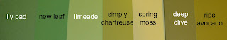
Of the lime greens, I prefer PTI simply chartreuse.  MFP limeade is more of a candy/neon lime.  Comparing the mid-greens, I prefer MFP lily pad to PTI new leaf.  MFP lily pad has a softer, more natural leaf green.  I always found PTI new leaf to be too bright, too distracting, and in need of a touch of yellow.  In the olive green department, MFP deep olive has a slightly deeper, more brown undertone.  PTI ripe avocado is more olive-y and yellowy.  Of the two, I don't have a clear preference. 

YELLOW/ORANGE
There are hardly any real matches in this category.  Most of the colors are pretty different and your preferences would depend on the application.  MFP orangerie sunset is 1 -2 shades lighter shade than PTI terracotta tile but with the same type of color.    

RED
 MFP garnet and PTI scarlet jewel are almost a perfect match.  MFP garnet is ever so slightly darker/browner (almost imperceptible).  Of the reds, PTI pure poppy is the definite winner (there is a MFP red I did not order called cherry slush).  PTI pure poppy is more of a true red.

PINK
MFP razmataz berry and PTI raspberry fizz are pretty perfectly matched.  Of the light pinks, I prefer MFP markie's strawberry milk because (as you can see) PTI sweet blush often reads peachy.  

PURPLE
There are no real matches in this category and my preferences are split.  I prefer PTI plum pudding and MFP grandma's lavender patch.  PTI lavender moon reads very pinky to me and I could never match it with PTI plum pudding.  MFP grandma's lavender patch is more real lavender and looks great with PTI plum pudding.  

BROWN
MFP chipboard is their version of kraft (don't have PTI kraft to show).  In person, MFP barely pink reads more of a warm cream than pink.  Of the chocolate browns, I actually wish there was an in between brown (MFP does have other browns I did not purchase but they have "flecks").  The MFP dark chocolate bar is too dark (less warm) and the PTI dark chocolate is too light and too crimson-y to me at times.  

So in summary, there's no real winner, but rest assured that there are alternatives out there!  Hope this helps you fill the gaps in your cardstock collections!  Thanks for visiting!   
{Aloha,  jj} 

Sunday, October 23, 2011

Waltzingmouse Sketch Challenge 70


So this week's Waltzingmouse Sketch Challenge is from WMS DT member Kelly Schirmer.  She's a real sweetie and she's come up with a great sketch.  So, as my boys played in the beautiful fall weather, mom got to work on 2 cards!  Woohoo!  (This is totally unusual for a slow poke like me btw)  Here's this week's sketch...  
This first card was inspired by the stamp of the Santa's sleigh silhouette.  I got my stamp from A Muse, but there is a WMS version that you could do the same thing.  The card is pretty self-explanatory, but there are a couple things that are hard to see in the pic.  The house is fussy cut and popped up a bit.  I cut out the window and put the yellow bit behind it for candle glow.  


The moon is also cut out and popped up a tiny bit.  I hit it with a little pearl dust for moon shine!  The background is lots and lots of blending of almost every dark blue ink I had.  Whew!  
I embossed the "believe" sentiment and had lots of messy embossing (I guess I didn't wait long enough for the background to dry).  This time, I actually like the messiness!   And the base of the card is a sparkly paper from Mark's Finest Papers.  It's so pretty and has a lovely sheen to it.    

The next card was a real quickie and it's a bit cheeky.  It's for a friend whose husband has literally had a mustache since 8th grade.  We tease him about it, but give him a pass because 1) he looks weird without it and 2) we all grew up in the era of Magnum P.I. & Smokey and the Bandit and secretly like it;)


Of course, I had to use the WMS sentiment "hope it tickles" and my mistletoe stamp to go with the Christmas mustache theme.  I don't have any mustache stamps, so I printed it off the web.


I die cut the circles and blended with Distress ink with the dies still on.  This card just makes me giggle!  Hope she likes it:)  That's all for me for now!  I'm off to try to get all this blue ink off my fingers.  Thanks 
for visiting and have a great week! 
{Aloha, jj} 

Believe Card
Stamps: Cottage Home (Waltzingmouse Stamps) Believe (Inkadinkado), Winter Wishes (A Muse) 
Ink: Paris Dusk (Memento), Broken China, Faded Jeans (Distress), Mustard, Sunflower (American Craft), Versafine
Paper


Enchanted Evening blue, white (Papertrey Ink), Sparkle Cardstock (Mark's Finest Papers)

Embellishments: Embossing Powder, Perfect Pearl dust
Tools: Circle dies (Spellbinders)


Tickler Card
Stamps: Festive Foliage, Teeny Trees (Waltzingmouse Stamps)
Ink: Bamboo Leaves (Memento), Antique Linen (Distress), Versafine
Paper: Poppy Red, White cardstock (Papertrey Ink)
Embellishments: Embossing powder, baker's twine (The Twinery)
Tools: Circle dies (Spellbinders), Corner Chomper

Friday, October 21, 2011

Waltzingmouse Sketch Challenge 69


I'm getting this one just under the wire!  I love playing with the Waltzingmouse Sketch Challenge, but I have to admit this week was hard!  I have very few Halloween and Thanksgiving stamps, so I had to take another tack.  
My card was inspired in part by this card by Iwona Palamountain.  She makes the loveliest cards and that particular color scheme really appeals to me.  The blooms of the Asian Gardens are perfect for this card with the 3 sizes of blooms.  
The bouquet wrapping was stamped ever so slightly with white polka dots and the background was put through the ol' Cuttlebug with a canvas impression plate.  Finished it off with some twine and a large sentiment from the Join Us set, and I'm done.  
Not your typical autumn card, but lots of fun to make!  Thanks for visiting!
{Aloha,  jj} 

Stamps: Asian Gardens, Join Us (Waltzingmouse Stamps), Polka Dot (Hero Arts)
Ink: Fresh Snow (PTI), Versamagic Turquoise Gem, American Crafts Pigment Grapefruit, Versamagic Sea Breeze
Paper: White, aqua mist, blush cardstock (PTI)
Embellishments: Baker's twine (The Twinery)
Tools: Canvas IP (PTI)

Friday, October 14, 2011

Waltzingmouse Sketch Challenge 68


Today I'm playing with my favorite challenge - the Waltzingmouse Sketch Challenge - #68!  As you can probably tell, I can't stop playing with my WMS:)  This week's sketch is fairly CAS and open to lots of interpretations.  I didn't have much time tonight, so I went with a simple design.  
This card was inspired by those chicken wire frame bulletin boards.  Here in Virginia they have antique fairs in the country and you see these types of things all the time.  I had the chicken wire stamp, so I thought why not?
Pinned to the frame are "polaroids" of my two boys and a simple banner.  I used the woodgrain IP on the frame, easy peasy.
Nothing fancy, but something fun to try!  Thanks for visiting!
{Aloha, jj} 

Stamps: Half Pint Heroes (Waltzingmouse Stamps) 
Ink: Tuxedo Black (Memento)
Paper: White, new lea, rustic cream cardstock (Papertrey Ink)
Embellishments: mini clothespins, baker's twine (The Twinery)
Tools: Label die (Spellbinders)

Thursday, October 6, 2011

Waltzingmouse Sketch Challenge 67


This week's Waltzingmouse Sketch Challenge and my new Waltzingmouse stamps are definitely getting me into the holiday mood!
I've been wanting to do a snow globe card and the new stamps from Waltzingmouse were the perfect thing.  The first card is a mini tag just like the sketch (it's only about 3-1/2" high). So much fun to make!  {Sorry for the weird pic, my camera is not cooperating tonight}  I love that little banner sentiment! 
I surprised myself by starting and (gasp) finishing another card!  Apparently, I really wanted to make snow globe cards:)  For this one, I used the unbelievable cottage stamp from the same A Cottage Home set.  Lots of copic coloring and fussy-cutting going on here.  
I really love how it all turned out.  


And I used my holographic embossing powder on this one too (see the swirlies)!  If you haven't seen the new 


Waltzingmouse stamps yet, go right now!


I'm off to bed!  Thanks for looking! 
{aloha, jj} 

Mini-tag Stamps: A Cottage Christmas, Festive Foliage (Waltzingmouse Stamps)
Ink: Tuxedo Black (Memento), Copics, Versamark, Blue (Colorbox)
Paper: White, brown cardstock (Papertrey Ink), glitter paper
Embellishments: Holographic embossing powder (Ranger), baker's twine (The Twinery)
Tools: Snowglobe dies (Amuse Studio), banner die, woodgrain IP (Papertrey Ink), circle die (Spellbinders)


Globe Card
Stamps: A Cottage Christmas, Teeny Trees, Fluorishes (Waltzingmouse Stamps)
Ink: Tuxedo Black (Memento), Antique Linen, Blue (Distress Ink), Rich Cocoa (Memento)
Paper: White cardstock (Papertrey Ink), glitter paper
Embellishments: Holographic embossing powder (Ranger), Baker's twine (The Twinery)
Tools: Oval die (Quickutz), Circle die (Spellbinders), Woodgrain IP (Papertrey Ink)