This is the first month I've ever participated in the monthly Papertrey Ink Blog Hop. I've lurked and lurked, but I always felt like I never had the "right" stamp or idea. But the point of the Blog Hop is to motivate you to try something different and to get to know some of the other PTInkers out there (both of which are great ideas), so here goes nothing:) This month, the challenge is based on this inspirational image rather than a theme.
 |
| From Design Sponge website |
I wanted to try the blended stripes in the inspiration picture. I knew I wanted to use my copics to try to get this effect, but I have to admit that copics scare the heck out of me. Even buying the markers was intimidating. What colors do I buy? What colors go together? What the heck does the blender do? I still don't know the answers to these questions, but I went ahead with my plan anyway. I wasn't ready to do a whole background, so I thought I would die cut one of my practice sheets. I only have enough copics to do pink and green:)
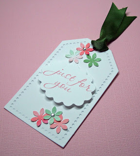
After cutting the leaves, I had some extra gradient paper that I didn't want to waste. So made a few more flowers for a coordinating gift tag. I didn't have a stamp to match, so I made a custom sentiment. This set is for an almost teen girl, so I tried to keep it young and fresh, but not childish.
I also did a quick gradient card this morning with watercolors. I whitewashed the over the watercolors for a softer look. This is the only picture that I could get to work, but you get the idea (in person, the colors are a lot more muted and that's hard to photograph).
I'm looking forward to seeing what all the other PTI Blog Hoppers have created. Thanks for looking and happy hopping!
I'm looking forward to seeing what all the other PTI Blog Hoppers have created. Thanks for looking and happy hopping!
{aloha, jj}
Leaf Card & Tag
Stamps: Communique Curves, Matstack #4 (Papertrey Ink)
Stamps: Communique Curves, Matstack #4 (Papertrey Ink)
Ink: Spray Rose Pink (Martha Stewart)
Paper: White cardstock (Papertrey Ink)
Embellishments: Small white rhinestones
Paper: White cardstock (Papertrey Ink)
Embellishments: Small white rhinestones
Tools: Tag and Matstack 4 dies (Papertrey Ink), Oval scallop and small flower punches (Fiskars), Linen/Canvas impression plate (Papertrey Ink)
Watercolor card
Stamps: Think Big #3 (Papertrey Ink)
Ink: Black (Memento)
Paper: Berry sorbet cardstock (Papertrey Ink)
Embellishments: Small white rhinestones
Paper: Berry sorbet cardstock (Papertrey Ink)
Embellishments: Small white rhinestones
Tools: White tulle


Copics scare me too!!! :) This is lovely...such a nice effect. I like the card with the tutu also. ;)
ReplyDeleteAwesome cards and tag! I'm not sure I can do the gradient thing with Copics....I'm just learning to color and shade with them.
ReplyDeleteLove your projects! I love the leaves you die cut from your 'practice sheet.' I think it's a fabulous touch! And all the little flowers are such a perfect addition. I can tell from the last picture that the whole card is beautiful - I love the details that I can see, so I'm sure the rest of it is just as beautiful! Nice job. ;-)
ReplyDeleteWow, your cards are really cool! You really nailed the challenge colors, and I love the touch of tulle on the bottom card!
ReplyDeleteSo soft and pretty!!
ReplyDeleteBoth cards are very pretty!! Copics are LOTS of fun once you get past the intimidation -- just keep PLAYING with them, you'll learn all of the answers soon enough :). Just gorgeous...I've been seeing lots of tulle on people's designs...love it!
ReplyDeleteSo soft and delicate, love the gradiant colors on the leaves!
ReplyDeleteBeautiful card & tag - love the pinks & greens! And love the shot of the gradient water color card, too. Copics - check out Suzanne Dean's website and Marianne Walker's - lots of tutorials & tips. Just takes practice.
ReplyDeleteCopics scare me because of the huge outlay for something that takes a long time to master. I love cheap, instant gratification :) Still, one day I want to get brave & make the plunge too.
ReplyDeleteI really like the clever way you used the diecut to highlight the stripes - they stand out so well against the white space. And your watercolour gradient card is lovely! I want to give that a try - especially with the lighter colours. My gradient cards always end up very dark.
These are both really cute!
ReplyDeleteI especially love the last card: the watercolor wash and the gathered tulle at the bottom are fantastic!
ReplyDeleteBeautiful cards and tag! I love the rainbow effect on the leaves on the first card and the tulle at the bottom of your second card!
ReplyDelete